David, can you elaborate on the design philosophies that guide your creative process and how they influence your projects?
The DAVID HICKS design philosophy considers architecture, interior design, and decoration as a cohesive whole.
Our signature is creating sophisticated and intelligent spaces that are both luxurious and functional.
The DAVID HICKS ethos emphasises detail and outstanding craftsmanship and informs all projects.
How do you approach the use of colour and texture in your designs, and what are some of your favourite combinations to work with?
As an enthusiast of classical and modernist architecture, I revel in refined symmetry.
By deftly balancing robust architectural gestures with sumptuous decorative accents, I weave multilayered stories in a harmonious, elegant way.
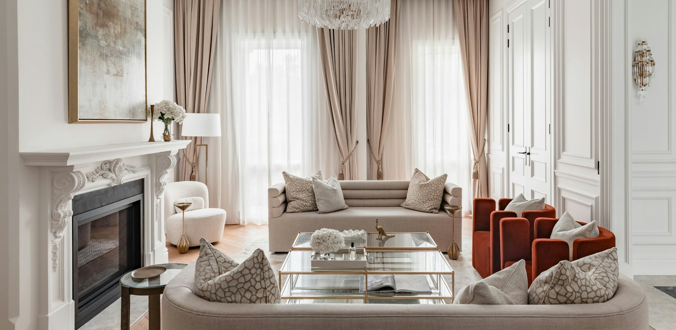
Combining smooth, rough, matte, and polished materials, I play with tension, mixing quiet luxury with more glamorous and exotic references.
I am known for my use of marble, for its natural pattern and colour, to create a sense of luxury and uniqueness.
I orchestrate a mood for each project by playing with tone, mixing classic cream, beige, and brown with more contemporary grey, silver, and black.
Colour is sometimes injected, mainly layered with artwork and decorative elements. This considered way of utilising colour and texture creates highly detailed environments that transcend time.
Can you share insights into how you tailor your design approach to meet each client's unique personality and lifestyle?
Our attention to client service is paramount in order to create and deliver the high standard of our projects.
I am personally involved in all aspects of project design and delivery, providing a unique, one-on-one relationship. Along with listening to and observing clients, this is particularly important when working on private homes.
Getting to know a client and how they live, their likes and dislikes, is a very intimate and highly detailed process that informs us greatly.
Our difference is that we tailor the approach to each individual project, assessing client requirements and providing informative insight into the complex process of design and construction.
Ultimately, we see ourselves as a conduit, a support team, for the client to realise their vision in the most creative and constructive way.
What do you consider the most underrated element in interior design, and how do you incorporate it into your projects?
The most underrated element in a project is the ability to deliver the project. Many designers have great ideas; however, the design concept can be lost if they are not highly detailed in documentation or project management.
We have a rigorous approach to documentation, detailing, and managing our projects, ensuring we deliver.
Interior planning is often overlooked, with clients engaging an architect before a designer. This can be detrimental to a project, as we often inherit spaces that are not resolved and that will not work for the client.
Over the years, this has led us to provide building design. The difference is that we start with interior planning, which lays the foundations for the building's shape and design. This approach is much more cohesive, as we can provide services in designing and building a new home.
Could you share the inspiration behind the elegant interior design concept of 5 Stonnington Place in Toorak?
The concept evolved from researching brutalist yet decorative Milanese villas. I liked the formality of this design approach, its simplicity, and its somewhat sparingly decorative embellishment. With formal and informal areas, we did not wish to have a definitive line between the two.
In keeping with our inspiration, we kept the spaces minimal whilst incorporating embellishment to the front part of the house, such as the fluted plaster wall dado and the marble-trimmed archways, to designate the spaces. The main attraction of the informal space is the streamlined kitchen, conceived in such a way, with edge-trimmed cabinets and rolled marble edges; it adds a nostalgic feeling to the home that it may not be entirely new.
Unstructured, organic patterned Patagonia stone was used on the island bench, an unexpected gesture with huge impact. This theme continues throughout the residence, the primary robe and ensuite being yet another major embellishment.
Marquetry timber veneer and Patagonia stone have been used again, along with soft grey cabinets, mirrors, and Venetian plaster.
This tension is what I play with - simple, resolved spaces blending into more decorative ones that nod to past decades whilst incorporating fresh and innovative detailing and materials.
Can you discuss any bespoke features you implemented at 5 Stonnington Place to elevate the living experience?
Like most of our projects, we have implemented many bespoke features in this home. We resolve many of the individual touches in the detailing, how the materials join together, and how they are integrated into the design sympathetically, looking at the technical aspects so important to the outcome.
Materials are also looked at, and how we can procure what we want; if not successful, we often have them custom-made. This was the case with the fluted plaster; we had this produced by a cornice maker to line the lower third of the walls with it.
I see stonework as another bespoke element as it requires researching, sourcing, and, more technically, how we can achieve the detail we want to produce from it. Much time is spent reviewing which parts of the slabs will be used and what pattern is desired once installed.
Many of the intricate details make the project individual; I liken it to a luxury item, such as a Chanel bag; how all the materials that make it are put together ensures the quality and craftsmanship.
Learn more at https://davidhicks.com/


